This guide is designed to help us produce documents that immediately look like they come from the same diocese. Though subtle, simple things like consistently choosing the same fonts and palette of colours help present unity, clarity and professionalism.
All information, including leaflets, reports and emails for public and internal use, should meet our corporate identity standards and follow the agreed house style.
This will help to ensure that all information produced by the diocese is consistent, jargon free and easy to read. We should put our people and parishes at the centre of all we do, making every effort to ensure that we communicate effectively with them and are better understood.
Contents
- House Style Guide for Diocese of Lichfield
- Preparing Documents
- Email signatures
- Logos and colours
- Fonts and text
- Web Pages
- Writing Tips
- Appendix
- Importing Styles from Diocesan Template to existing documents
Preparing Documents
We recommend documents should be prepared in Word. Unless you want readers to interact with the document (fill in forms etc), upload to the text and images to the website as a webpage: if it really must be a formatted download (eg a carefully designed poster), use pdf.
Begin with the DoL style Word template document.
Set a page size that matches the final document – if you want an A5 booklet, choose an A5 page size rather than an A4 landscape document. This is so that when you want to distribute the final document as a pdf, people can read the pages in the right order. If they wish to print it as a booklet, the options are in the print dialogue.
If there is a chance of the document being revised or reissued, include a version number or date. The default template includes the FileName in the footer. You may need to right-click on the grey-backed file name and select ‘Update Field’ so it shows your chosen document name. Web pages automatically include a ‘last updated’ statement at the end of the page.
Use page numbers and if sufficiently complex or technical, paragraph numbers – it makes it easier to discuss a document with others and quickly highlight when people are looking at different versions.
We discourage the use of Microsoft Publisher – it is more advanced than most uses require, is not universally viewable on all diocesan computers and does not translate well for professional printing. If you cannot achieve the result you are after with Word, please consult the Communications Department or a professional designer who will have the right software for the task.
Email signatures
For legal reasons, Email signatures need to conform to the Diocese of Lichfield – Email Signature Guidance Policy, found on the diocesan server at "N:CommunicationsCommonPolicyDiocese of Lichfield - Email Signature Guidance Policy.docx"
Logos and colours
2016: A new era dawned with the arrival of Bishop Michael, and it was time to retire the old ‘Going for Growth’ slogan – not that it is wrong or we no longer want growth, but our 5 Themes expressed the diocese’s aims clearly, and one of the priorities that emerged in the Vacancy in See search was the need to more strongly identify the geographical area of the diocese and our place in the Church of England. Smaller dioceses have it easy! As a result, the diocesan logo (visual identity or branding if you like) was updated. The mauve went and a joyful orange came to the fore.
But by 2019, a clearer set of priorities emerged: DVE, and a review of our branding began, though interupted by Covid19. However, it is clear that the 5Themes must be retired, and for the meanwhile the best advice we have is to stick with the basic logo: it would be good to review all your team’s docs/pdfs/ppt and delete those no longer needed or update to remove any 5Theme (or, worse, ‘Going for Growth’) branding and formatting to align with the guidance in this document as soon as quiet moments make it possible.
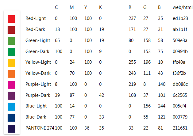
The five theme icons gave us a rich choice of colours to use in our communication and we envision no change to that at the moment. A suggested progression of colours is set up through the default styles in the diocesan Word template.
Fonts and text
Always use the font Segoe UI for plain text (Microsoft have now released a free version named Selawik which can be downloaded and used as an alternative if Segoe UI isn’t already on a computer). Use a minimum size of 10 point for plain text, including on email. 11 point is preferred.
For main headings use Arial Rounded MT Bold. This looks better when the letter width is set to 90%*. Both these fonts are available on all diocesan PCs.
Most written communication is prepared in Outlook (email) and Word (documents). For the former, please see the Email policy document distributed at the start of 2014: "N:CommunicationsCommonPolicyDiocese of Lichfield - Email Signature Guidance Policy.docx"
For Word documents, we urge beginning new documents and basing letterheads with these templates: "N:CommunicationsCommonLogo and Style Guide - for staff" .
Existing documents can be ‘converted’ by importing the formatting and Styles from this same document – see Appendix 3.
Text effects
Avoid using capital letters in multiple words – use Heading styles to increase impact of headings. Readers with various visual impairments find words full of capitals harder to read, so only use capitals together where needed for abbreviations. Long lines of capital letters have been perceived as ‘shouting’ since the dawn of email.
Keep use of bold and italic effects as minimal as possible
Avoid using underline altogether – it is applied automatically to hyperlinks in Word, many websites and pdf. Using underline anywhere else is a recipe for confusing readers.
Instead, use Heading styles to organise the content of pages and documents in a logical and easy-to-navigate way – begin a document with Title style, significant divisions/chapters with Heading 1, subdivisions with Heading 2 etc.
*This adjustment is already made in the Heading styles in the diocesan Word template.
Web Pages
Web pages are best when minimal scrolling is required. Aim for a maximum of 200 – 350 words in the main content of a page. It is preferable to break long material into two or more pages.
Whenever possible try to get an appropriate photo or graphic.
Ensure that links to other websites are set to open a new browser window or tab, so the page you are linking from remains open. (In Mura, choose New Window (_blank) in the Target tab of the Link dialogue box).
Writing Tips
The Plain English tip
Avoid jargon. Say what you see. Don’t dress things up too much.
The Conversational Tone tip
Write as you think / talk.
The Humour tip
Sometimes it may not be appropriate, but a little light humour can work wonders, especially when dealing with seemingly dry subject matter.
The Personality tip
It is essential to define your own voice and to allow the reader to get to know you a little bit. It’s a noisy world out there and we prefer to read articles with a bit of verve, rather than bland reporting. Try to stand out from the crowd.
The One Comma tip
Multiple-comma sentences can often be reworked to just include one comma. Keep things nice and concise. There are all kinds of exceptions, so this one is certainly not set in stone.
The Short Sentences tip
Shorter sentences are better than longer ones. If in doubt, use a full stop and move on.
The Sub-Headers tip
Again, these help break up the page and sort your page content into easily-digestible chunks and are great for readers who skim your page before tuning in properly.
Consistent diocesan habits
We always use Revd not Rev or Rev’d – there are arguments for each, we just need to be consistent. It’s better to write Bishop Penelope than +Penelope: the latter won’t be understood by some.
We only capitalise proper names – Lichfield Diocese or Diocese of Lichfield or St Chad’s Parish, but generically we talk about the diocese, the parish and the wardens. The only exception is failing to capitalise Readers – or prepare to answer to Bishop Michael’s PA. And on the same topic, they are not Lay Readers, that’s a tautology…
One other most common error is quote marks. “Double quotes are only to be used for quoting passages of speech or text” according to my esteemed colleague while single quotes should be used for elements or concepts or clarifying phrases. Using double quote in those situations is just not the ‘done thing’. If the few words could equally be emphasised by using italics instead, don’t use double quotes.
Talking of emphasis, it is often preferable to use italics instead of bold – the latter jumps out of the page whereas italics can give emphasis just when it is needed. There are occasions where bold aids navigation to particular points or concepts in long paragraphs or definitions, but often just makes the eye jump around before the reader should get to that point.
Appendix
Importing Styles from Diocesan Template to existing documents
If you have existing documents that you want to update/reissue looking like a diocesan document, follow these straightforward steps:
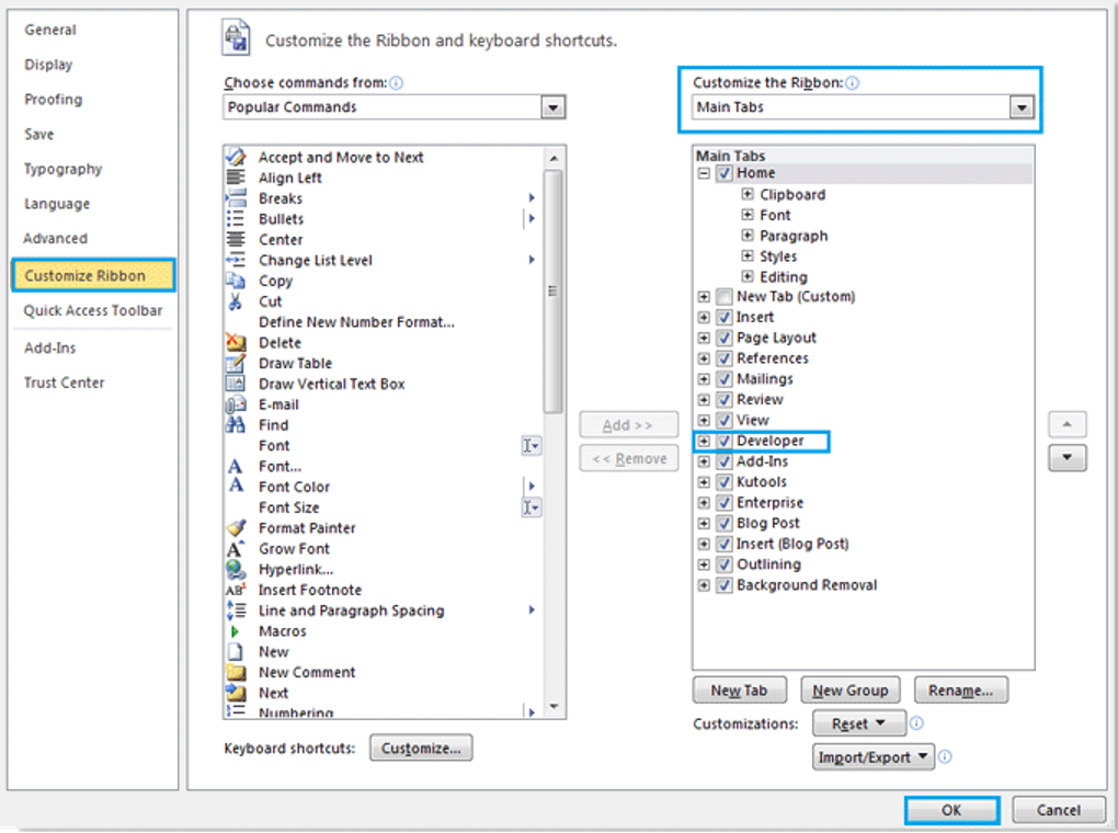
Step 1: Open the document you want to import style to in Word then click File > Options> Custom Ribbon to add the Developer under the Main Tabs to ribbon. See screenshot:
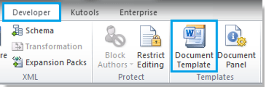
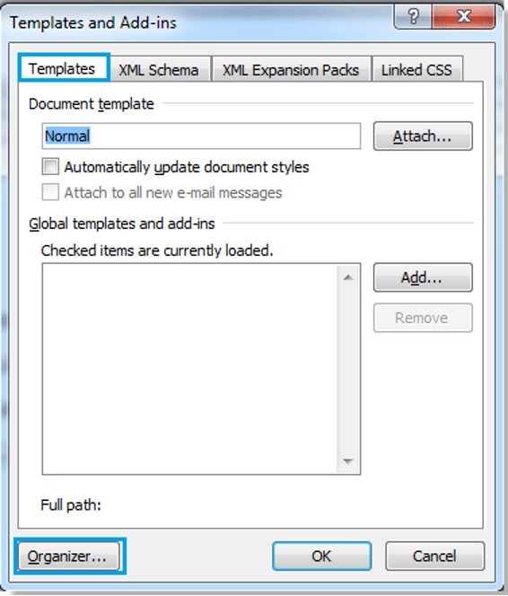
Step 2. Click Document Template under Develop Tab, there will be a popup dialog, and click Organizer. See screenshot:

Step 3. There will be another popup dialog, click Close File in the right, and the check box will be replace with Open File. See screenshot:
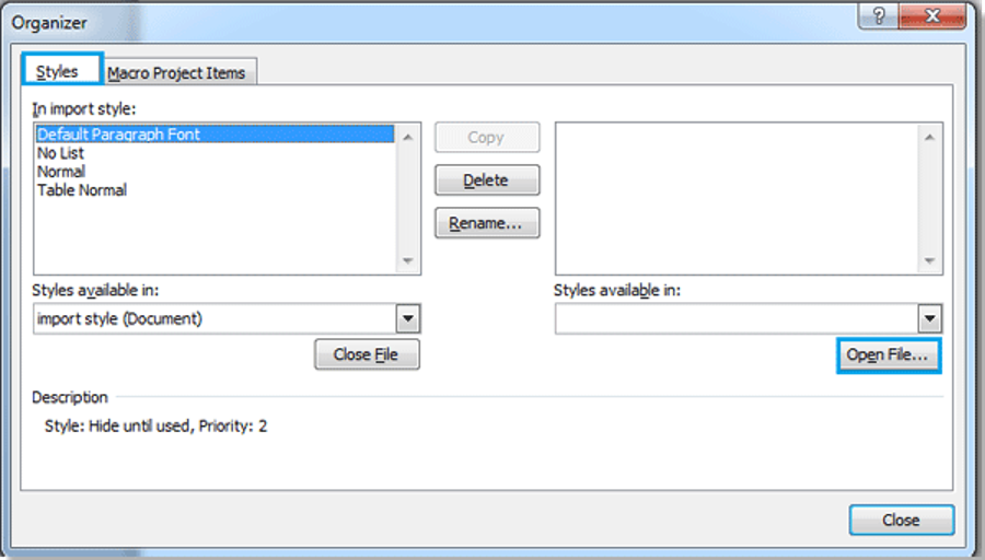
Step 4. Click Open File, and select the file you want to import style from (eg the latest Diocese Letterhead document.docx), then click Open.
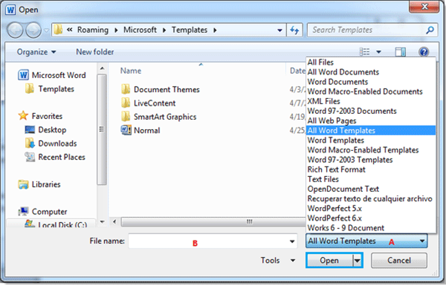
You can search the file you want according to the format by clicking A (a Word Document not Word Template in this case), and also can enter the name of the file in File name box to quickly search it.
Step 5. After opening the file you want to import style from, you can select the style of the file in the right box and click Copy, it will copy the style to the left box. See screenshot:
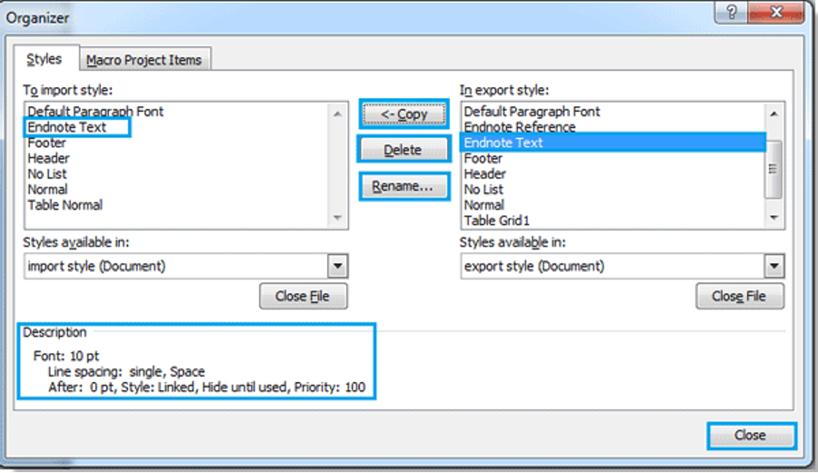
Note:
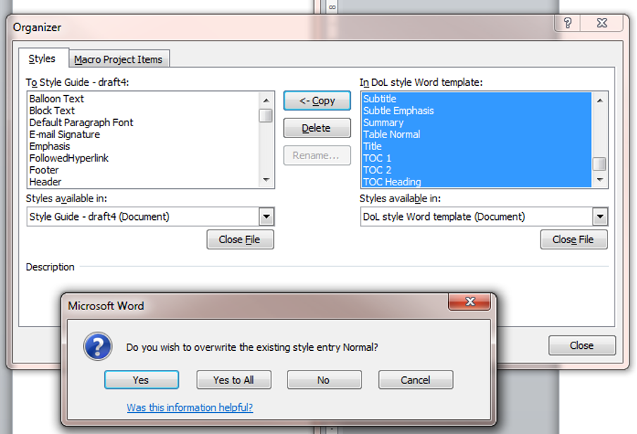
1. Where the  arrow point to will be the place import style. And these two files can copy the style from each other. (Press Ctrl+click or Shift + click to select multiple styles). In this instance, click the style at the top of the list, scroll to the bottom and press Shift + click. When you click you will be asked if you wish to overwrite the existing style – click the Yes to all option.
2. You also can delete or rename a style.
3. There will be a description under the left box when you select an individual style in the box.
Step 6. After the copy, click Close, the style importing is finished.
[Instructions adapted from http://www.extendoffice.com/documents/word/1004-word-import-styles.html, accessed 6/10/2014]