This zip folder contains all the resources for producing clear documents in our work for Lichfield Diocese.
It contains:
- A folder of Word examples for Letterhead and Compliment Slips – choose your preferred, adapt the details and save to your own pc for future use.
- A folder with Word and Powerpoint templates for all other uses: these should be copied onto your laptop.
- Go to your ‘Documents’ folder and find in there the ‘Custom Office Templates’ folder.
- Copy the templates into there.
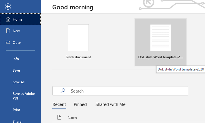
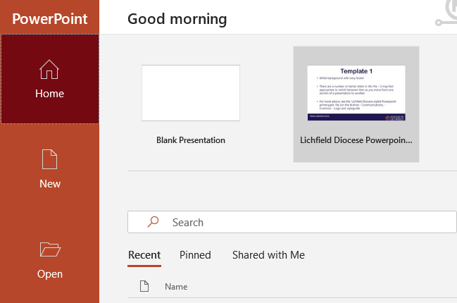
- When you next open Word or Powerpoint, the template will be one of the two default options:


- If this do not appear, in Word/Powerpoint go to Options (bottom of left hand column when launched) and in the Save tab make sure the 'Default personal templates location says 'C:UsersusernameDocumentsCustom Office Templates': click 'ok' and relaunch.
- For many old documents, updating into current formatting is very quick:
- Select All and Copy from old doc
- Paste using the ‘destination theme’ option into the new template
- Change headings using the Style settings – a Title, main sections in Heading 1, subsections into Heading 2. This process is shown in a minute-long video.
- Check remainder of document against our diocesan style guide.
- The Powerpoint template incorporates a number of options to add variety to your presentations – colour can be used in creative ways (though don’t use it in ways that disadvantage those with colour-blindness).
- A folder of logos. Note that we have now withdrawn all logos that include the 5Themes as they have been superseded by our DVE focus. We began a rebranding consultation in late 2019 with the aim of simplifying and reflecting our Diocesan Vision. This project was paused during lockdown and is yet to complete. In the meantime, please only use the simple roundel or roundel+Diocese of Lichfield logos.
- There are still options on white or navy backgrounds
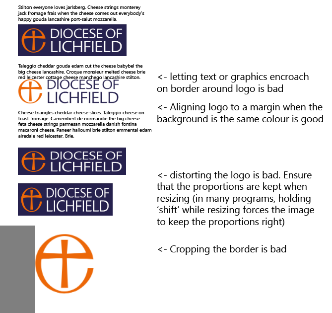
- Remember to ensure that a clear border remains around it wherever you use it:

- The logos here are ok to use up to 200mm wide – ie the width of an A5 postcard / vertical A4 notice. If you need larger, please consult the Comms team.
- It would be good in quiet moments to review all documents your team has currently in use (ie accessible on the website) and update them as needed – any 5Theme- or (please no!!) ‘Going for Growth’-branded docs/pdf/powerpoint etc need revising. Check text formatting (see ‘Style Guide’) at the same time.
- Style Guide: This video also describes how to write and present documents so that we are consistent as a diocesan team. Many of us have never had any proper training in using word processing and many others were taught by people who’d only used a manual typewriter!
